Chapters
Preliminary 1. Histories of the Book and Literacy Technologies
Preliminary 2. Bibliographical Alterities
3. Literacy in the Ancient World
4. The Middle Ages in the West and East
5. The Invention and Spread of Printing
8. Politics and the Public Sphere
9. Industrialization of Print
Chapter 9. Industrialization of Print
Automation, mass production, changes in literacy, and aesthetic responses
Industrialization changed every aspect of print, media, production, consumption, and literacy across populations and technologies. For more than three hundred years, from the 1450s to 1800, since Gutenberg’s original invention, the innovations had been minor and change gradual. The invention of the stereotype, a method for making a mold from a metal form of letterpress type and creating a cast copy that could be used for printing had amplified the means of production, but not radically changed its basic features. Every letter in a metal font still had to be carved by hand on a punch, stamped into a matrix, then cast, finished, and set in a stick. Automated punch-cutting and casting would not become viable until the very end of the 19th century. But demands for printed matter increased the pressure to produce more, faster, cheaper, books, magazines, newspapers, posters, handbills, menus, tickets, train schedules and a wide range of ephemera.1 As printed material had to function in an increasingly competitive market—and to serve the purposes of advertising and attention getting—the range of graphical styles proliferated as well as the formats and genres of print material.
Key technological innovations enabled changes in printing: lithography, photography, the use of steam and then electricity for power, high-speed production of paper, and motorized printing presses. Methods of distribution of print changed as well, as railroads began to stretch across vast areas of the European continent, the British Isles, and North America to connect shipping and land networks.2 The idea of printing schoolbooks in Chicago, Philadelphia, or Boston and distributing them for a nation of young readers in increasingly compulsory education was economically viable as well as culturally impactful.3 Rapid changes in literacy rates increased readership across a wide range of materials aimed at diversion, entertainment, self-education, and moral improvement. [Figure 1a] [Figure 1b.]
Changes in print technology took place as part of broad cultural shifts. A century of precedents and experiments preceded James Watts’s release of a working steam engine in the 1780s, but once brought to market, his device was attached to an enormous number and variety of mechanical devices. Though wind and water had been used as energy sources in the past, the ability to harness steam in a controlled manner meant that tasks of all kinds could be automated at a scale of efficiency and speed that outstripped human and animal labor. Manufacturing at this scale created changes in patterns of wealth, settlement, labor, and global networks of raw material extraction, colonialization, and exploitation. In this massive transformation, the availability of books, like that of other commodities helped to fuel demand. Literacy rates in the United Kingdom, for example, are estimated to have gone from 67% for men and 51% for women in 1841 to about 93-94% for both groups fifty years later.4 Many cultural factors account for this, but in terms of the impact on printing, the effect is that everything changes: type, bindings, paper, readership, business models, institutional practices and educational patterns. Many of these changes, though modified by digital technology and fundamentally altered by networked environments, remained part of the basic infrastructure of printing and are still in place today, even as the role of print shifts within the larger media ecology.
Presses and printing
In 1800 the Earl of Stanhope produced the first cast-iron printing press.5 Its ability to create greater pressure would enable larger printing areas, but speed of production was not much enhanced until the German, Friedrich Konig, assembled a press with a mechanism for raising and lowering the printing platen. Once attached to an energy source, this machine could print entirely on steam power. His designs were sufficiently perfected by 1814 for the London Times to adopt them. From approximately 250 sheets an hour, printed on the Stanhope, the number went to 400 and then skyrocketed to over a thousand large (approximately 36” x 22” inch) sheets. The inking of the type form was done with rollers in this mechanized process, not by ink balls, another improvement that eliminated work by hand. By mid-century, the flat platen was replaced by a cylinder, making pressure greater and impressions more rapid.
Increasing the volume of printing consumed more paper. Cotton and linen rags, the main source of paper pulp, could not keep up with demand, nor could the labor-intensive hand-making process.6 The Fourdrinier machine was the first successful continuous paper making apparatus, and was conceived and patented in the first years of the 19th century. Initially used to make sheets more than 12 feet wide and 45 feet long, it was soon creating a continuous roll from a non-stop feed of pulp. Automating the process did not solve the rag shortage, however, and a paper-making process using wood pulp only became viable in the 1840s. The process involved the use of strong acids, and much 19th-century paper disintegrates rapidly as a result, making its lifespan much shorter than papers made in the Renaissance through the 18th century.
By the 1850s, more than 25,000 copies an hour could be printed on motorized presses, but type still had to be set by hand.7 The use of stereotyping, mentioned in an earlier chapter, meant that molds taken from type could be used to cast multiple copies of a form, but the technology remained somewhat primitive until around the 1870s. Meanwhile, though it was stalled technologically, typography was undergoing profound design transformations.
Changes in Type Design
Innovation in type design proliferated in the 19th century, and the shape, form, style, decoration, and sheer variety of letters were astounding. Typographic innovators, Robert Thorne and William Thorowgood, started producing “fat faces” around 1803, and along with Vincent Figgins, launched Egyptian or “slab” serif faces in 1810.8 These flamboyant fonts, with their bold shapes and exotic features were viewed to be “shouting” their advertisements—for lotteries, theater events, and other entertainments and goods. Sans serif faces were also invented in the early 19th century, with elaborate runs of sizes and weights available for use in the 1830s and 40s. But these contributions, fundamental as they were to the transformation of the landscape of printed material, were only the beginning of the rage for decorative, multi-part, shaded, filled, elaborated, floriated, and bedecked letterforms. The early 19th century may have found the strong shapes of the fat, slab, and sans serifs striking, but late 19th century print culture, particularly in advertising, was a riot of faces competing for attention.9 To create fonts large enough for theater and concert advertising, typographers began making letters from wood. The lateral router, an instrument able to cut letters to any scale from wood slabs in combination with the pantograph, both invented in the 1830s (the first by Darius Webb, the second by William Leavenworth), made rapid production from models possible. [Figure 2a] [Figure 2b]
But the challenge of automatically setting metal type, especially text type which was long, wordy, and tedious, remained unresolved until the 1880s. The German designer, Ottmar Merganthaler, had the idea to combine the mechanics of a typewriter (an invention of the 1860s) with a casting machine. [Figure 3]The elaborate result, the linotype, had a complicated set of movable parts, each of which had to imitate some motion of a human compositor (selecting, placing, spacing, sorting). But the speed of the apparatus made its advantages quickly apparent. Typing each line and casting it individually changed composition practices, and, along with the monotype (it cast individual letters), a somewhat more modular, two step process with a punched ribbon and caster invented by Tolbert Lanston in 1887, it remained the industry standard until the mid-20th century, when phototypesetting came along.10 The final major change in industry practices was a contribution by Linn Boyd Benton, whose pantographic punchcutting machine automated the final piece of the process—the demanding work of creating steel punches.
While these changes were occurring in the technology of typography, poster and book design were also influenced by the graphic freedom of lithographic printing–accidentally invented by Aloys Senefelder in 1799. [Figure 8] Unlike engraving and relief blocks, lithography involved direct drawing on smooth limestone slabs.11 The artistic immediacy of the format attracted painters and skilled draftsmen, well-known fine artists as well as the host of trained craftspeople whose anonymous contributions are still appreciated in the art of packing labels and other commercial work. But the rage for chromolithography, color printing, made it “the people’s art” in the 19th century, and its increased capacity for detail and rendering made the prints extremely popular. Chromolithography was also used for all kinds of book production—for children, gift books, illustrated works in many fields (medicine, botany, and so on), though the fineness of copperplate engraving, mezzotint, and other intaglio processes continued to distinguish the images produced in this manner.12 Artists with renowned careers, academicians of the highest renown, such as Joseph Mallord William Turner and John Martin, provided engraved images as illustrations for classic works, while illustrators such as George Cruikshank, Kate Greenaway, and Gustave Doré made their substantial reputations in the pages of books.13 [Figure 4] [Figure 5] [Figure 6]
Serial publications
Publication patterns changed rapidly with industrialization. The illustrated press was another new area of media activity, with monthly magazines, daily news, and specialized publications seeking niche markets. Journals devoted entirely to the publication of literary work or its review made their appearance in the first years of the 19th century. They replaced the omnibus publications that had included essays, useful information, calendars, recipes, advice on behavior and treatment of ills, that had been characteristic of the earlier, 18th-century, serial publications, like The Pennsylvania Gazette. Harper’s New Monthly Magazine flourished from 1817 to the 1850s, succeeded by another long-lived serial by the same publisher, Harper’s Bazaar.14 The London Illustrated News began publication in 1842, The Penny Illustrated was published for half a century, beginning in 1861.15 Magazines for “ladies”, which had patterns for embroidery, sheet music, recipes, advice on domestic and personal matters, appeared in the late 18th century London, but Godey’s Lady’s Book, inaugurated in 1830, like the Ladies’ Home Journal, first published in 1883 were American serials. A brief look at the titles of serials that appeared in English in every decade of the 19th century shows a proliferation of categories and specialization of readership around topics: religion, politics, music, trade, science, fashion, art, astronomy, medicine, sport, and mining, for instance. Each had their own publications. However long-lived these were, or successful, they attracted readers and advertisers and demonstrate a dramatic boom in literacy and perceived value of access to knowledge, skills, and instructions on behavior, matters of taste, and invention across increasing areas of the population. Some, like Leslie’s Illustrated, gained currency through reporting on news events. Images from the Civil War, made by journalistic illustrators, made for compelling news whose substance and urgency touched every aspect of American life.16 The skill of these artists, who drafted quickly and often directly from observation in the field, made the late 19th and early 20th century a great era of illustration in America.17 Their work and approach had an influence on modern painting in America, and the documentary impulse of these publications had a legacy long into the 20th century.
Image production
Perhaps no technique for image production changed cultural perception as much as photography.19 Invented simultaneously in France and England, with slight differences in the technical specifics, photography blended knowledge about the ways chemical salts acted when exposed to light and the use of a camera obscura (essentially, a box with a pinhole) to focus an image. Though both aspects of the photographic process had been known before the 19th century, their combination in the 1820s revolutionized cultural concepts of image and resemblance. Henry Fox Talbot, the British inventor, titled his 1844 book publication promoting the photographic process, The Pencil of Nature.20 [Figure 7a] [Figure 7b] The idea that light "wrote” an image directly was implied in the title, though his images are more mundane—photographs of house, garden, workmen, and a direct exposure of lace in an early photogram. The Frenchman, Joseph Nicéphore Niépce is credited with fixing the first exposure—an image of rooftops outside his Paris window, while Louis Daguerre’s technique of direct exposure on a silver-plated copper sheet, the daguerrotype, became a popular portrait form in a very short time. With the exception of silhouette cutting, which enjoyed a vogue in the 18th century, no form of making a likeness had been available to any but the wealthiest members of society.21 Almost overnight, studios catering to the middle class appeared along boulevards in Paris and elsewhere, supplying likenesses in the exquisite metal surfaces of daguerrotypes.22 These stiff images (the process required long poses) are detailed records of dress, posture, bodies, appearance, accessories, and expressions of a certain demographic of the population.
Finding a way to reproduce photographic images as part of a mass printing process took time. Similarly, finding ways to use photographic techniques to reproduce other materials also required effort.23 But both were aspects of the 19th-century print world, as if the arrival of industrialization had been met with an aesthetic deemed suitably mechanistic for modern imagery. By the 1860s, wood engravings were being made from photographs, and etching processes using photosensitive emulsions and half-tone screens, which break continuous tone into discrete dots for printing, came along in the 1880s. All of these changes allowed photographic imagery to bring reports of foreign and exotic lands, objects, and people into view within the thick pages of travel albums meant for consumption in parlors and salons far from the hard-to-reach realms of such places as Egypt, Palestine, North Africa and the Arabian peninsula. The documentation of people and landscapes using photographic method resulted in huge projects, like that of Edward Curtis and the American Indians, or Timothy O’Sullivan and the western areas of the United States. These projects, like the albums, were often driven by or benefitting from the processes of colonialism, imperialism, expansion, and even genocide in the case of American indigenous people. The books are documents of their time in many ways, as material and historical artifacts even if they are now read against the grain of their original impulses in many cases.
Photographic journalism did not make its way into mass circulation publication until the 20th century, even if photographic documentation, such as Matthew Brady’s famous images of Civil War battlefields provide graphic evidence of historical events of the period.24 Techniques for reproduction of photography in mass printing processes were the subject of much experimentation in the 19th century, but were not fully successful until about the turn of the century.
Publication
The publication of books altered in physical form, as publishers’ bindings became an advantage for advertisement and distribution.25 Booksellers’ windows could display the stamped cloth covers stretched over boards and glued, rather than offer un-bound blocks for custom binding. Though private libraries continued to exist, the idea of a book as a ready-for-market commodity was aided by the creation of an automatic folding machine in the early 19th century that stitched signatures together.26 Automated trimming would follow at mid-century, and by 1900 the processes of stitching, gluing, gathering, and cutting were all done by machine. Without such automation, a high volume of production would have been impossible. Some products, those with elaborate paper-engineering such as the pop-ups, harliquenades, and movable books or novelty cards, had to be made and assembled by hand, providing work for a cottage industry consisting mainly of women’s labor. Hand-coloring and stenciling were similarly outsourced, though improvements in color printing eventually provided cost effective alternatives. But techniques for color printing improved steadily through the 19th century.
“Steam serials,” published in installments, along with the 1-3 volume triple-decker were standard publication formats. The cost of a full set of such an extensive work might run 15-18 shillings in an era when a skilled laborer’s weekly salary was about 21 shillings. The marketing advantage of selling installments is evident, and the fame of many major 19th century literary figures was produced on this serial model: Honoré de Balzac, Victor Hugo, and Alexander Dumas in French (Dumas is characterized as being “an industry unto himself”), Charles Dickens, George Eliot, and Sir Walter Scott in England, are just a few of the most renowned.27 Publisher Richard Bentley set another standard by putting classic authors into cheaper editions, combining a commitment to canonical work with an interest in popular distribution.28
Novel reading increasingly became perceived, along with the reading of romantic poetry, as somewhat of a hazard (the novel Madame Bovary, first published in 1856 by Gustave Flaubert, is a cautionary tale about the capacity of fiction to inflame imagination). Already identified in the 18th century, the social "problem" intensified. In France, heavy taxes were imposed on novels to discourage excess consumption.29 In the United States, the works of American writers Henry Wadsworth Longfellow, Ralph Waldo Emerson, and Nathaniel Hawthorne enjoyed considerable popularity and influence, but the runaway bestseller of the 19th century was Harriet Beecher Stowe’s Uncle Tom’s Cabin.30 First published in 1852, it sold a million and a half copies within two decades and was translated into 8 languages: Finnish, Danish, Russian, Portuguese, German, French, Italian, and Spanish.
In addition to fiction and poetry, travel guides became popular through John Murray’s proliferation of red hardbacks in the 1830s and Karl Baedecker’s authoritative guides that first appeared in the 1850s-1890s.31 Trains featured into publishing in another way as well—travellers sought reading materials for their journeys, and the “littérature de gare” – a genre of books acquired at the train station–was one result. The production of serial fiction to accompany trolley rides and commutes would be part of the later 19th century, as cities expanded into suburbs and travel on urban rail lines became part of daily routines.32 The chap book, small and inexpensive, took its name from the term “chepe book” meant for a downmarket readership. Paperbacks first appeared in the 1870s, the yellow covers of French novels are one famous example. Practical books for gardening, home repairs, cooking, domestic matters of all kinds proliferated as well, and another famous work by Flaubert, Bouvard et Pecuchet makes fun of a pair of old bachelors who believe all useful knowledge may be acquired from books—and who fail miserably when they make an attempt at farming through such second-hand knowledge.33
Responses to Industrialization
The aesthetic impact of industrial methods on print was perceived by publishers in the 19th century who were committed to the production of finer work than that created by the mass-produced serials and cheap book trade. Smudgy presswork, worn illustration blocks that had lost much of their crispness through repeated use, bad paper, shoddy bindings, and a certain slipshod attitude towards design compromised in favor of efficiency all registered as problematic.34 The Chiswick Press, founded in 1811 by William Pickering, was an early attempt to create an antidote to commercial publishing with fine press aesthetics within the English context.35
In Charles Whittingham, the publisher Pickering found a printer enthusiastic for the task of creating elegant works. 36 Whittingham had been apprenticed to the family printing trade as a young man, and sent to Paris to study with the Didots. The French influence is evident in the works of the 1840s for which he is renown, such as Lady Willoughby’s Diary (printed for the publisher Longman’s in 1844) and folio reprints of earlier editions of The Book of Common Prayer (from 1549, 1552, 1604, 1662, and 1843) as a historiographic project. In combination with a two-volume study by William Maskell, published in 1846, a study of the history of liturgy in the English church, these volumes demonstrated equal care for design, printing, and scholarly engagement with bibliographical and textual history. The Chiswick Press anticipated the humanist revival of the early 20th century, and Whittingham had the venerable Caslon foundry produce historical fonts for his use. [Figure 9]This appreciation of the material quality of print distinguished the productions of the printer, but it was the tasteful design and layout that made the work stand out from the more haphazard approaches of commercial presses. But, by and large 19th-century printers and publishers dealt in volume, worked quickly, and produced popular and consumable works.37
A shift in aesthetic sensibility in Britain came in part through the influence of John Ruskin, an art critic and historian. Following the success of his book, Modern Painters (1843), in which he praised the work of J.M.W. Turner alongside painters of the Renaissance who embodied his ideals of truth to nature, he began an elaborate study that became The Stones of Venice.38 [Figure 10] In an era in which architecture, landscapes, and built forms were reflecting the values and materials of an industrial era, Ruskin sought to recover the beauty of details and forms he found in the crumbling buildings of Venice. The influence of Ruskin’s work was enormous and a Gothic revival in British architecture can in large part be traced to the impact of his writings. Ruskin’s books were illustrated with his drawings, and his studies included observation of the ruins and remains of the works he considered exemplary, but also, in other volumes, studies of natural geological formations, from which he drew additional inspiration.
Ruskin’s impact on the development of the widely influential Arts and Crafts movement began with his contact with a group of young painters who would take on the name Pre-Raphaelite Brotherhood. Dante Gabriel Rossetti, William Holman Hunt, and John Everett Millais founded the group in 1848 as a deliberate attempt to revitalize British art by returning to sources of inspiration in the medieval period.39 These artists in turn entered into partnerships with the firm of Morris, Marshall, Faulkner & Co., which had been established in 1861 by William Morris to produce furnishings, textiles, and decorative artifacts.40 Rossetti and the artist Edward Burne-Jones were among the participating partners, and life-long collaborations would ensue. Morris, who came of wealthy parentage, had read Ruskin’s work and in it found inspiration for a rejection of the products of industrial manufacture—to which he objected on political grounds as well. For Morris, the effects of industrialization could only be countered by socialism and a return to craft-based production. The deleterious effects of industrial labor on quality of life as well as quality of goods was of central concern to him, and, along with many other figures in his circle, he advocated political reforms as well as aesthetic ones throughout his life. A prominent man and progressive thinker, Morris’s ideals of utopian community, hand-labor, and production based on medieval guild models could not be fully realized, but his prolific output became the inspiration for an Arts and Crafts-based aesthetics throughout Europe, Scandinavia, Russia, the British Isles, and North America.
Morris’s aesthetics, like those of the Pre-Raphaelites, were conspicuously medieval in their orientation, and Morris’s influence on furnishings brought organic, floral, and elegant patterns into widespread use. [Figure 11]A master-designer, Morris created an approach to decoration that spread world-wide. Chairs, wall-paper, and textiles with his designs were imitated broadly, but he was also a serious writer and editor. His literary interest in medieval tales and legends led to collaboration with scholars intent on translation works from Old Norse and Icelandic into English.41 The titles he published even before the Kelmscott Press reflect these interests, such as The Story of Sigurd the Völsung and the Fall of the Niblungs (1871) and A Tale of the House of the Wolflings (1895). He completed many translations, several in collaboration with Eiríkr Magnússon, an Icelandic scholar who specialized in sagas. Grettis Saga, The Saga of Gunnlaug the Worm-tongue, the Völsung Saga and other publications from the 1860s onward demonstrate his engagement with the language and imagery of this heroic past. His own writings, as well as the designs for stained glass and other visual objects, show this influence quite vividly, as do his own poetic works.
Morris’s passions for social reform also drove his work, and he lectured and published extensively for socialist groups, including the Socialist League, which he helped found in 1884. Book design had always been among his interests, and he had had the idea of starting a publishing enterprise for decades before he finally created the Kelmscott Press, late in his life (the press issued its first volume in 1891, and Morris died in 1896). Drawings, designs, and plans for collaborations with his friend Burne-Jones show the idea of a press developing over many decades.
Morris was a prolific writer, with some of his output running to multiple volumes, such as The Earthly Paradise, published in the late 1860s. The titles of his projects, such as The House of the Wolfings (1889) and Defence of Guenevere (1858), give evidence of his commitment to the medieval sources on which he drew for inspiration for his unparalleled textile and tapestry work, as well as the hand-illuminations he included in his manuscripts. But the founding of the Press allowed him to realize works in print with types of his own design (Troy, Golden, and Chaucer, each based on his drawings with guidance from Emery Walker), ink produced according to his specifications, paper made exclusively for his use, and bindings that were either plain blue paper wrappers or vellum consistent with his sense of the medieval book. The Works of Geoffrey Chaucer, Newly Imprinted, 1896, illustrated with woodblocks cut from designs by Edward Burne-Jones, exemplifies the Kelmscott aesthetic. Medieval in flavor and motif, enormous in scale, it is a monument to book design in the Arts and Crafts style.
Morris’s principles of book design were created in dialogue with Emery Walker, a printer with expertise in engraving and design.42 At the first Arts and Crafts Exhibition, in 1888, the two men noted the absence of books within the overall display. Even Morris’s own writings were not present, since the form of their publication had nothing in common with the aesthetic they supported. Walker gave one of the several lectures organized for the exhibit. His was on the topic of “Letterpress Printing and Illustration.” The lecture was a turning point for both, but particularly Morris. Walker showed images (magic lantern slides) of medieval books and illuminations and these inspired Morris to consider the principles that would underpin the vision of “The Ideal Book” he outlined in the 1893 essay with that title.43 Walker provided technical expertise and aesthetic guidance in all aspects of Morris’s work on the Kelmscott Press, and his skills are evident in the design of the typefaces used for its publications. The first design, based on fonts by Nicolas Jenson, was created using photographic enlargements for study and copying, and was a modified version of that Renaissance master’s roman letterforms. The Golden and the Troy moved towards blackletter styles. Morris page layouts and designs borrowed proportions and other features from medieval works, and his primary argument was that the graphical features, design elements, and other material properties of a literary work were essential to its production and reception, and not to be treated merely as a means to communicate a text. The idea of integral work, and of the relation of production values to literary ones, would influence artists across the aesthetic spectrum throughout the 20th century and beyond while increasing appreciation of pre-modern—medieval and Renaissance—contributions to book design.
Morris’s influence was three-fold. First, Arts and Crafts approaches to print design proliferated throughout commercial publications in the form of decorated initials, head and tail pieces, elaborate borders, and medieval and organic motifs. The use of organic, interlaced leaves, vines, flowers, and patterns was ubiquitous (women with elaborately flowing hair would become another conspicuous motif, but not from Morris’s designs). Children’s books, novels, mass-circulation works and those created within the more limited realms of the private press, made use of the style throughout the 1890s and 1910s.44 In addition, the Kelmscott Press inspired the creation of other independent private and fine presses. In a limited way, private presses had already existed, creating publications often meant for non-commercial circulation. Fine presses, however, modeled on Kelmscott, had commercial aspirations and produced limited edition works in the hand-crafted mode that Morris had pioneered. The fine press movement in the British Isles included the Vale Press, Dove’s Press, Ashendene, and Eragny and inspired imitation throughout the United States. Each was a unique undertaking embodying the vision of an individual whose aspirations to aesthetic design and fine work drove their publications. Almost all took some inspiration from Morris’s Press. Finally, Morris’s commitment to pairing aesthetic and political goals was extended in the many Guilds and Societies founded in the 1880s and 1890s to promote Socialist reforms alongside artistic ones. The Century Guild was founded in 1882 by Arthur Mackmurdo, Selwyn Image, and Herbert Horne. Its publication, The Hobby Horse was inaugurated in 1884 by Emery Walker, an associate of Morris’s, and the Art Worker’s Guild was founded in 1884.45 The Combined Arts Society was established in 1888 in part through the work of the distinguished illustrator and designer, Walter Crane. These are among the most renowned examples, but they do not exhaust the list of such organizations world-wide. [Figure 12]
The Arts and Crafts movement’s idealism was not universal. Some of its aesthetic features came to characterize Art Nouveau, which took its name from the gallery of celebrated art dealer, Siegfried Bing, who opened the influential exhibit space in Paris in 1895. Art Nouveau had no particular political associations. The gallery brought Japanese prints, textiles, artifacts, and clothing into view and the asymmetrical designs and nature motifs complemented the Arts and Crafts aesthetic. Bing commissioned works from living artists, such as Louis Comfort Tiffany, whose designs have come to be synonymous with Art Nouveau, as well as importing materials from Asia.46 The styles were imitated in commercial production as well as finding their way into the households of affluent consumers.47
Among other imitators of Morris, Elbert Hubbard, an American from East Aurora, New York, saw himself as the carrier of the Kelmscott flame.48 He visited Morris, who was elderly and dying, and inspired by the visit, returned to New York and built the Roycroft guild. Hubbard created a workshop for manufacture of furniture and other Arts and Crafts style artifacts, but he also created the Roycroft Press. Hubbard was a successful author, folksy and patriotic, and his homilies and writings made him popular and affluent. The Roycroft Bibles, which came out of his workshop, were affordable editions with conspicuous Arts and Crafts influence, and found their way into many American homes in the early 20th century, often alongside lamps and tables of similar design and affordable make. [Figure 13]
Far more decadent in literary mode and style, the Vale Press of Charles Ricketts and Charles Shannon extended the aesthetic of the Arts and Crafts movement into an idiosyncratic elegance that was suffused with eroticism.49 Their work, as that of several other renowned figures, is associated with several Decadent artists and writers. Among these, Aubrey Beardsley, the short-lived and highly talented artist-illustrator, created the images for the flamboyant author Oscar Wilde’s transgressive play, Salomé, first printed in French in 1891 and published in English in 1894 by the British publisher John Lane. The images were considered so suggestive that for the English version they had to be modified to pass censorship. Wilde’s poem, The Sphinx, issued in a masterly edition that bears the imprint of the Vale Press, shows the fine design sensibility of Ricketts in the color printing, typographic style, and the line illustrations that perfectly match the book’s overall design.50 These late 19th-century works were part of a British aesthetic movement that took some of the principles traceable to Ruskin and Morris and put them at the service of esoteric and finely wrought work, some of which was clearly part of queer culture of the 1890s which could not express itself openly, given laws against homosexuality in Britain and elsewhere.
The fine press movement gained momentum in the 1890s and early 1900s. The idea of a “humanist revival,” spawned a serious engagement with Renaissance humanist type and page design. Appreciation for Jenson’s work was widespread, but also, for the work of Aldus Manutius, Ernst Ratdolt, and others whose typographical skill embodied principles that had brought humanist handwriting into metal type design in the incunabula period.51 In Britain and North America, presses founded in the spirit of this revival began to shed some of the excess decoration associated with Arts and Crafts publications, and to develop a more typographically oriented approach to the page. The most dramatic demonstration of this is in the work of Thomas J. Cobden-Sanderson’s Dove’s Press.52 His 1903 edition of The Bible opens with a single long bold majuscule “I” stretching the length of the page. This initial of the first word, “In the beginning [...]” is the only decorative element on an otherwise black and white printed layout. The aesthetic sensibility was clear, and its debt to–but distance from–the ornate pages of Morris’s Kelmscott productions was evident. Cobden-Sanderson wrote his own “Ideal Book” essay, as well as other small tracts which expressed a religious belief and spiritual tendencies that were also far from Morris’s socialist commitments. A number of printers and designers would establish their own presses, such as Daniel Berkeley Updike (Merrymount Press, 1893), Frederic Goudy with Will Ransom (Village Press, 1903), and John Henry Nash (in San Francisco, in 1916). Others, like Bruce Rogers (work with Riverside Press, 1895) and Stanley Morison created bridges to the mainstream academic and commercial printing worlds. Morison’s designs of the Times New Roman font, originally produced for the London Times in 1931, have proved an enduring expression of the humanist revival in design, and also, bring us full circle back to the beginnings of industrialization, with the mechanical presses sending sheet after sheet of that newspaper into publication as the first experiment in steam-power printing.53 Responses to industrialization were not always oppositional, and many of the features of design practice that were created in response to the perceived shoddiness of commercial work became part of commercial production either directly or by imitation.
Conclusion
Industrialization changed every aspect of life in Western culture, from the way things were produced to the demographics of consumption. Printing was part of this change, and the development of materials meant for mass readership is evidence of the shifts in literacy that took place as part of changes in schooling and perceived benefit to society in having a population that could read and write (and do basic mathematics). Books came to serve as a means to self-education as well as to offer entertainment, enlightenment, or instruction to the already educated. The range of materials in print, and the use of printed matter for transactions of all kinds, was unprecedented. Changes in technology also had an impact on the printing trade, whose processes gradually became automated across the course of the 19th century. Lithography, chromolithography, and also photography added new possibilities to image production and reproduction, and styles of journalism as well as illustration reflected these opportunities. But the perception of the quality of mass produced printed books became increasingly negative, and reactions to industrial production combined aesthetic and political criticisms of its impacts on workers and commercial products. As the 20th century began, a number of printers and designers were already bridging the commercial-private-fine press communities. 20th-century changes in book production and artistic engagement with books as art would alter the landscape of publishing yet again, as would the gradual expansion of corporate models of media production and consolidation.
Related Spotlights:
- Elisabeth Asher, Godey's Lady's Book, June 1865
- Genesis Carrillo, Our Nig: Sketches from the Life of a Free Black by Harriet E. Wilson, 1859
- Megan Gilbert, Daphnis and Chloe, by Charles Valentine Le Grice, 1803
- Olivia Kope, Laws of Contrast of Color, by Michel Èugene Chevreul
- Erin McAllister, Dante's The Divine Comedy by William Blake, 1824-27
- Alex Valencia, The New Japan Spelling Book, William E. Griffis, 1872
- Alexandra Whalen, Alice's Adventures in Wonderland, by Lewis Carroll, 1866
- Daniel Williford, The History of Reynard the Foxe, by William Caxton, Kelmscott Press, 1892
Resources:
- Elisabeth Asher, Nineteenth-century Women's Magazines
- Rachel Poutasse, Reference Guide: Encylopedias to the Cyclopaedia
- Joanna Smith, Movable Books
- Alex Valencia, Japanese Literature During The Meiji Era (1868-1912)
- Alexandra Whalen, Curiouser and Curiouser: The Early Years of Children's Literature
- Daniel Williford, The Art of Illustration in 19th Century England
Notes
1 John Lewis, Printed Ephemera (Cowell Publishing, 1962) ↩
2 Distribution networks and technology: http://www.ushistory.org/us/25b.asp ↩
3 Schoolbooks and universal education: https://en.wikipedia.org/wiki/History_of_education_in_the_United_States, and for a more in-depth study of education in England, see Derek Gillard: http://www.educationengland.org.uk/history/ ↩
4 Rob Banham, “The Industrialization of the Book 1800-1970” in Eliot and Rose, op.cit. and https://ourworldindata.org/literacy/ ↩
5 James Moran, Printing Presses: History and Development from the Fifteenth Century to Modern Times (Berkeley: University of California Press, 1973) ↩
6 Paper production, http://www.hqpapermaker.com/paper-history/ and Nicholas Basbanes, On Paper (London: Penguin, 2013) ↩
7 Clark, op.cit. and John Lewis, Anatomy of Printing (New York: Faber and Faber, 1970). ↩
8 See: Figgins https://www.linotype.com/3300/vincent-figgins.html and for a careful study of his fonts: https://www.typography.com/fonts/sentinel/history/; and for more samples of his fonts see: http://blog.typoretum.co.uk/2013/03/28/type-specimens-from-the-vincent-figgins-type-foundry-%E2%80%93-1815/ On William Thorowgood (and the relation to the work of Robert Thorne) see: https://fontsinuse.com/uses/5578/the-story-of-our-friend-the-fat-face. ↩
9 Alastair Johnston, Alphabets to Order (New Castle, DE: Oak Knoll press, 2000). ↩
10 For changes in printing technology, see the timeline assembled by APHA (American Print History Association): https://printinghistory.org/timeline/ and also Gerry Beegan, The Mass Image: A Social history of Photomechanical Reproduction in Victorian London (Hampshire and NY: Palgrave, 2008). ↩
11 Michael Twyman, A History of Chromolithography (London: British Library Publishing Division, 2013). ↩
12 Estelle Jussim, Visual Communication and the Graphic Arts (New York: R.R. Bowker and Co.,1974). ↩
13 John Harthan, The History of the Illustrated Book (London: Thames and Hudson, 1997). ↩
14 For a history of serial publications, see Paul Fyfe’s excellent site: https://ncna.dh.chass.ncsu.edu/imageanalytics/history.php. For other useful online resources see http://research.library.gsu.edu/c.php?g=115461&p=754653 and http://guides.library.yale.edu/c.php?g=295929&p=1973040 and for a specialized journal in this area: http://www.amperiodicals.org/ ↩
15 London Illustrated News: https://archive.org/details/illustratedlondov37lond and http://www.iln.org.uk/ ↩
16 Frank Leslie’s Illustrated http://www.accessible-archives.com/collections/frank-leslies-weekly/ ↩
17 On illustrated books, see Henry Clarence Pitz, 200 Years of American Illustration (New York: Random House, 1977); on American Illustrators see National Museum of American Education: http://americanillustration.org/ also http://www.artcyclopedia.com/history/golden-age.html ↩
18 Seth Lerer, Children’s Literature: A Reader’s History from Aesop to Harry Potter ↩
19 Beaumont Newhall, History of Photography from 1839 to the Present (New York: Museum of Modern Art, 1982) and Jussim, op.cit. for applications to printing technologies. ↩
20 Helmut and Alison Gernsheim, A Concise History of Photography (New York: Grosset and Dunlap, 1965). ↩
21 R. L. Megroz, Profile Art Through the Ages (London: Art Trade Press, 1948). ↩
22 Newhall, op.cit. ↩
23 Jussim, op.cit. ↩
24 See http://www.metmuseum.org/toah/hd/edph/hd_edph.htm For a good resource on 20thcentury American photojournalism see Ross Collins: https://www.ndsu.edu/pubweb/~rcollins/242photojournalism/historyofphotography.html ↩
25 Anthony Rota, Apart from the Text (Private Libraries Associatoin, 1998) ↩
26 Thomas Tanselle, Book Jackets: Their History, Form and Use (Charlottesville: Bibliographical Society of the University of Virginia, 2011). For a brief overview see: http://www.powis.com/resources/learn/binding_history.php ↩
27 On 19th-century publishing and serial chapters see: http://www.uvic.ca/library/featured/collections/serials/VictorianSerialNovels.php and https://www.writersinspire.org/content/victorian-publishing-history ↩
28 For a profile of Richard Bentley see: http://blog.tavbooks.com/?p=1206 and also http://spartacus-educational.com/PRbentleyR.htm ↩
29 French taxes on novels to discourage consumption. ↩
30 Uncle Tom’s Cabin. https://www.harrietbeecherstowecenter.org/utc/ . ↩
31 For an overview of travel guides in the 19th century see: http://www.bdkr.com/rul.php?art=278 and Baedeker, For facsimiles see: https://archive.org/details/baedeckers ↩
32 Stuart Sillars, “Towards A Typology,” The Art of Brevity: Excursions in Short Fiction Theory and Analysis Mass, ed. Per Winther, Jakob Lothe, Hans H. Skei, (Columbia, SC: University of South Carolina Press, 2004). ↩
33 Gustave Flaubert, Bouvard et Pécuchet (1881) https://www.gutenberg.org/files/25014/25014-h/25014-h.htm ↩
34 Matthew Taunton https://www.bl.uk/romantics-and-victorians/articles/print-culture ↩
35 Roderick Cave, The Private Press (New York: R.R. Bowker, 1983). ↩
36 For this and other references on the Whittingham press, see Roy Stokes, Esdaile’s Manual of Bibliography (Lanham, MD: Scarecrow Press, 2001);This is an updated version of Arundell Esdaile’s Manual of Bibliography (London: Allen and Unwin, 1931). (p.90 for Whittingham). ↩
37 Taunton, op. cit. ↩
38 John Ruskin, Stones of Venice (London: Smith, Elder, and Co., 1851). See also online: http://www.gutenberg.org/ebooks/9804 ↩
39 For an introduction to the Pre-raphaelites see: http://www.metmuseum.org/toah/hd/praf/hd_praf.htm ↩
40 William Peterson The Kelmscott Press, (Berkeley: University of California Press, 1991). ↩
41 Colin Franklin, Printing and the Mind of Morris (London: Rampant Lions Press, 1986). ↩
42 William S. Peterson The Kelmscott Press (Berkeley: University of California Press, 1991). ↩
43 William Morris, “The Ideal Book,” full text of the 1893 paper: https://www.marxists.org/archive/morris/works/1893/ideal.htm and On Morris: https://deepblue.lib.umich.edu/bitstream/handle/2027.42/108171/kelms.html ↩
44 Renée C. Tafoya, Graphic Design History: https://visualartsdepartment.wordpress.com/arts-crafts/ ↩
45 Johanna Drucker and Emily McVarish Graphic Design History: A Critical Guide, op.cit. and Philip Meggs, History of Graphic Design, (Wiley, 1983). ↩
46 For more information on Bing, and about Art Nouveau, see: https://aboutartnouveau.wordpress.com/2013/11/11/siegfried-bing/ ↩
47 John Russell Tayler, The Art Nouveau Book in Britain (Edinburgh: P. Harris, 1980). ↩
48 For information on Elbert Hubbard and his publishing, see http://www.roycrofter.com/ ↩
49 Maureen Watry, The Vale Press (New Castle, DE: Oak Knoll Press, 2004). ↩
50 Oscar Wilde, The Sphinx (London: E. Mathews and J. Lane, 1894). ↩
51 For a discussion of the Humanist Revival, see Drucker and McVarish, op.cit. and Meggs, op.cit. as well as Robin Kinross, Modern Typography, op.cit. ↩
52 See Roderick Cave, op.cit. ↩
53 On Stanley Morison, see https://www.britannica.com/biography/Stanley-Morison ↩
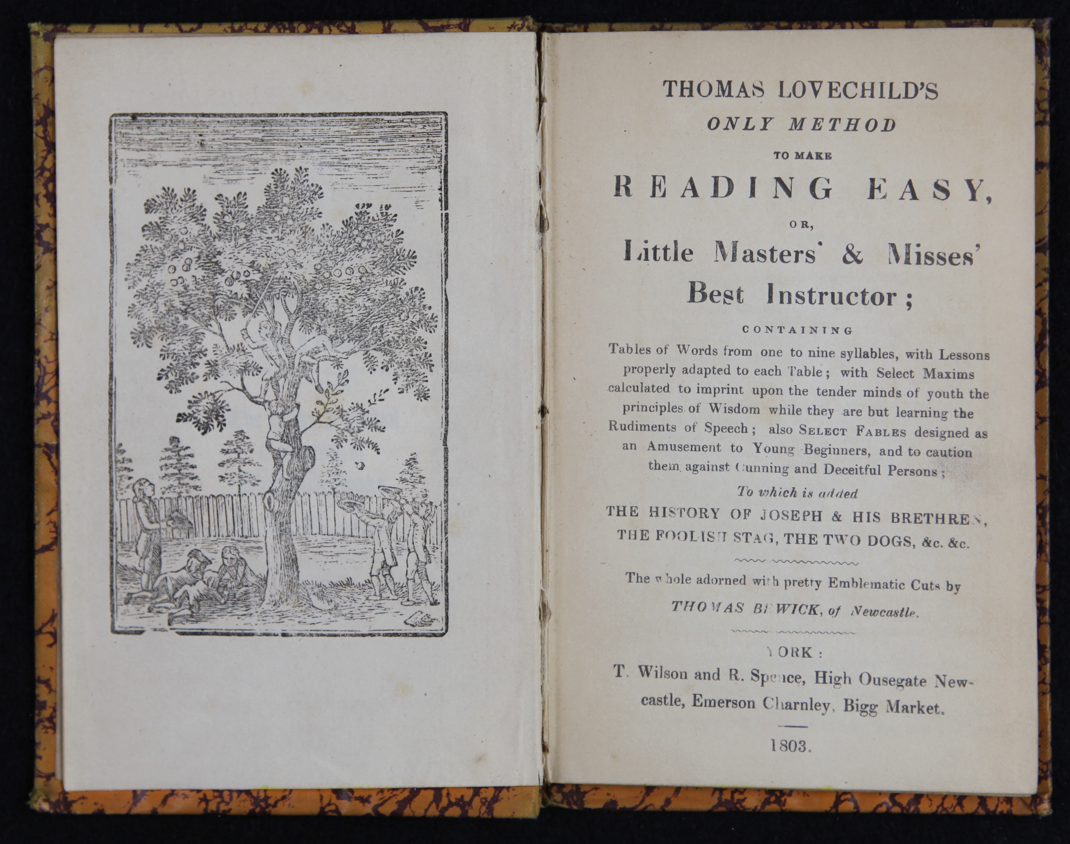
Figure 1a.
Thomas Lovechild’s Only method to make reading easy […]. R. Wilson and R. Spence, York, 1803.
CBC PE1120 .H37t 1803
Literacy rates grew in Britain and North America in the 19th century, and schoolbooks like this one played a crucial role in educating the young reader. Bible stories and moral tales provided subject matter deemed appropriate for instruction.
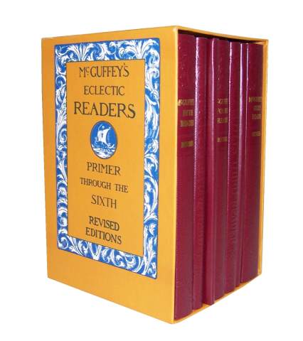
Figure 1b.
William Holmes McGuffey, McGuffey’s Eclectic Readers. Truman and Smith, Cinncinatti, OH.
PE1117 .M265 1879
School text books became a specialized industry. The publisher and editor William Holmes McGuffey created a series of graded readers with “eclectic” content—stories and poetry by famous writers. The content and tone of the readers changed as the decades to reflect changes in American attitudes, values, and culture.
↩

Figure 2a. Marr Typefounding Company, Specimens of ancient & modern printing types, rules and borders. Edinburgh.1800.
Z250 .M348s
Demand for innovative typography increased dramatically in the 19th century. Advertising and commercial printing, aided by the advent of steam-driving presses and machine-made paper, created a market for eye-catching letterforms such as these. Decorative letters in large and small sizes were made in metal and wood (for posters and other large-sized public display) and companies competed for clients by creating type specimen books and often elaborate samples of printing.
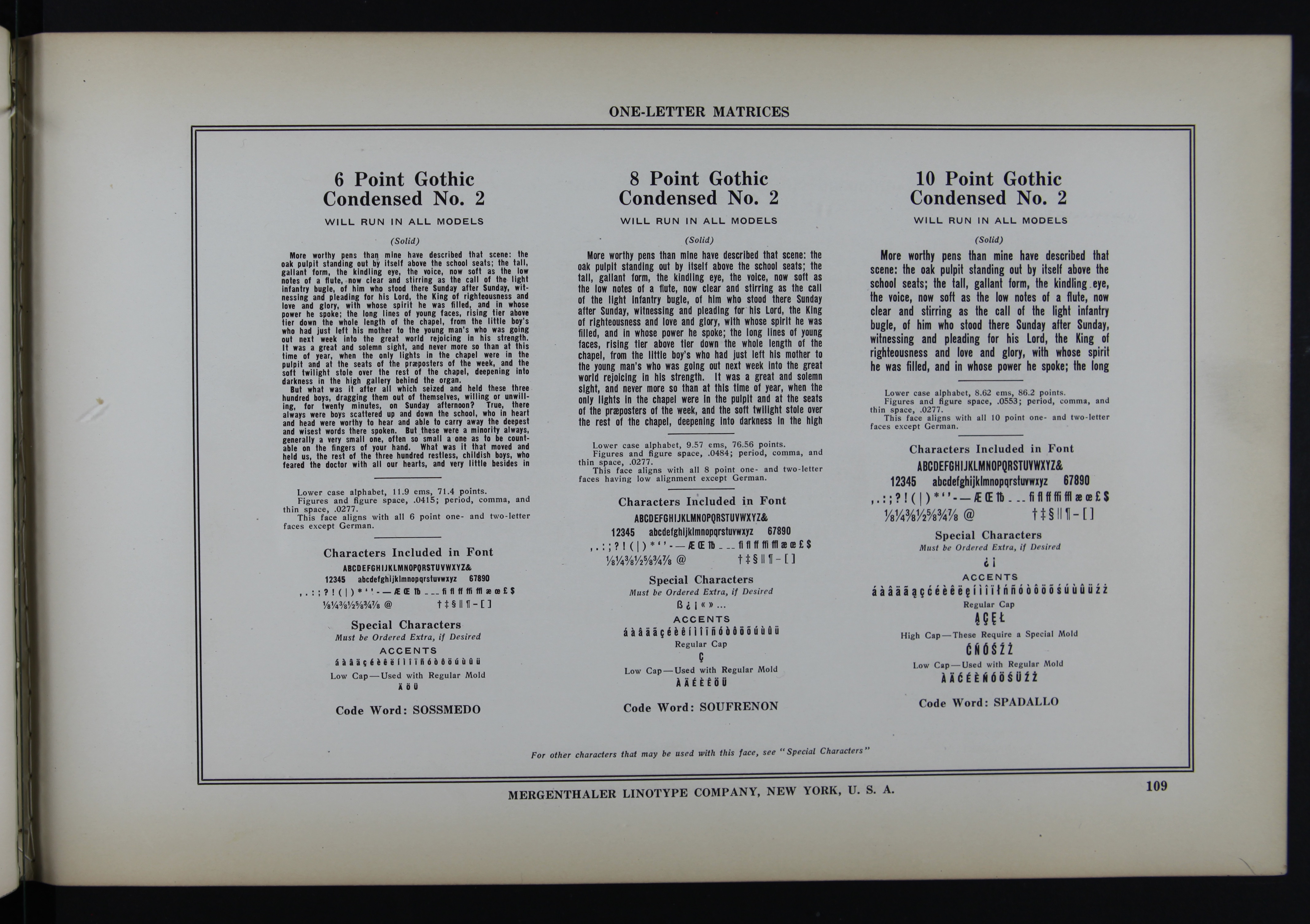
Figure 2b. Merganthaler Type Specimen Book. The Company, Brooklyn, New York, 1915.
Z250 .M348s
In the 1880s, the German inventor Ottmar Merganthaler created a machine capable of composing type with hot metal cast in lines. The invention of this process, known as linotype, transformed hand-composition into keyboard-based production in the printing industry, increasing speed and capacity. Linotype was used for newspapers, book publishing, and mass-circulation magazines well into the late 20th century. ↩
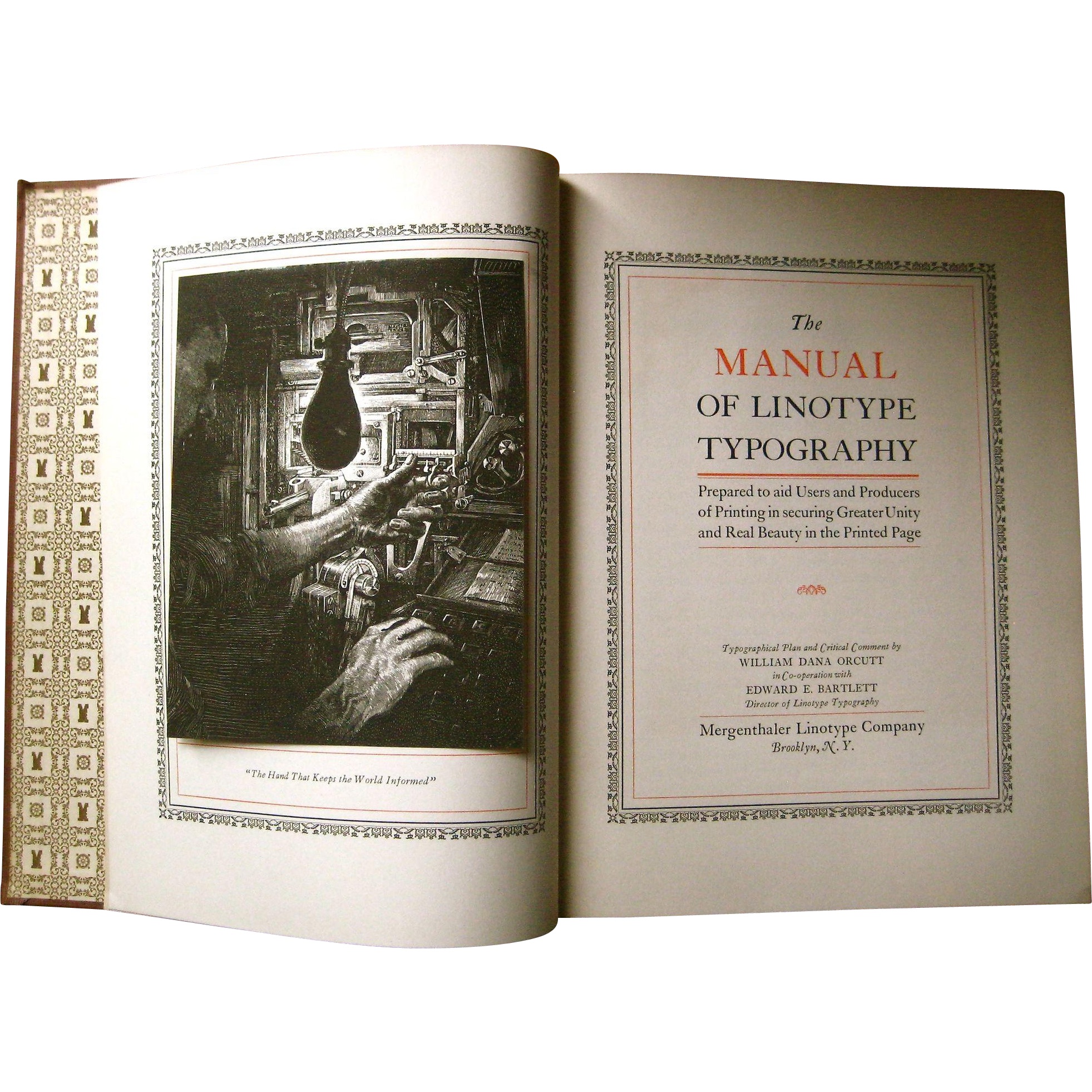
Figure 3.
William Dana Orcutt and Edward E. Bartlett, The Manual of Linotype Typography, . Brooklyn, NY, 1923.
*Z250 .M54m
This elegant manual strives to demonstrate that mechanical typesetting can emulate the finest hand-set type and page design. The careful layout and use of traditional red and black inks succeed in making their argument. The design is far from the gaudy decorative world of advertising and display types, and embodies the early 20th century turn revival of interest in “humanist” designs from the earliest decades of printing, particularly those of the Italian presses in the 15th century.
↩
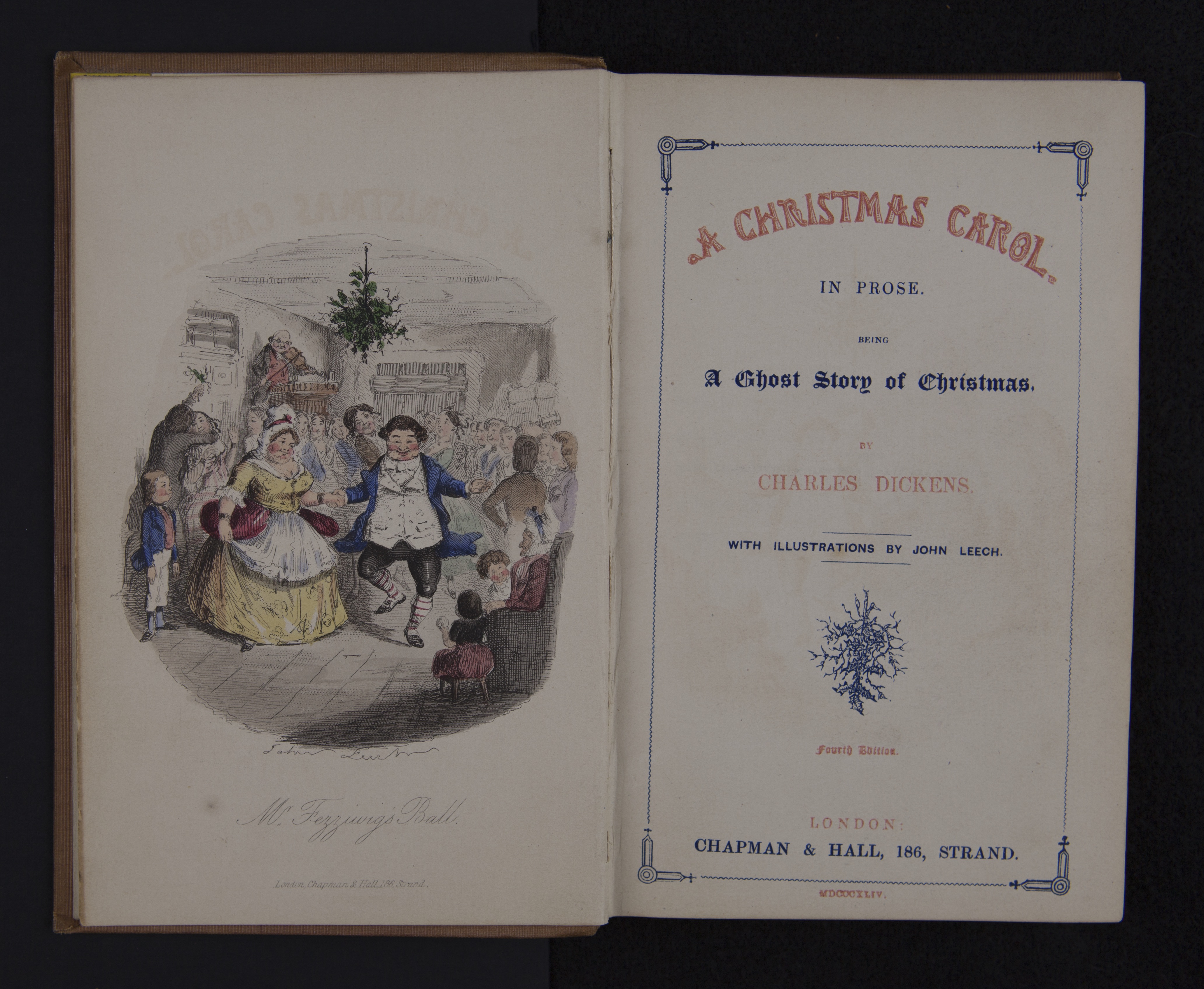
Figure 4.
Charles Dickens, A Christmas Carol,. London, Chapman and Hall, 1844 illustrated by John Leech.
CBC PR4572 .C46 1844
While the type on the title page is printed in two colors of ink, the illustration is hand-colored, probably using stencils (note the hard edges around the individual areas of color). These are not deluxe editions, but meant for a popular audience. The extra effort in creating colocolor was largely done by women, who could complete the work at home and be paid by the piece.
↩
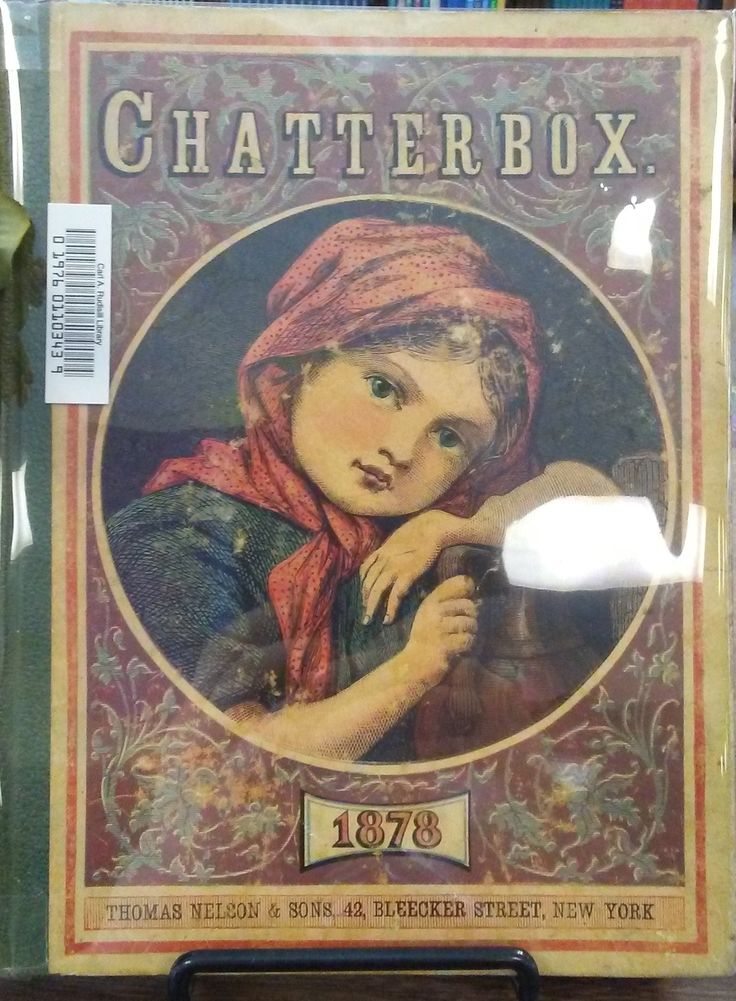
Figure 5.
The Chatterbox. 1878.
IS Department collection
Mass circulation magazines targeted specific segments of the population—women, men, children. This serial is typical of the illustrated publications created to amuse and educate the same group as that embodied in the image of the child on the cover. Poems, stories, tales of adventure, abounded in this magazine for young readers. The use of chromolithographic methods allowed color printing to proliferate.
↩
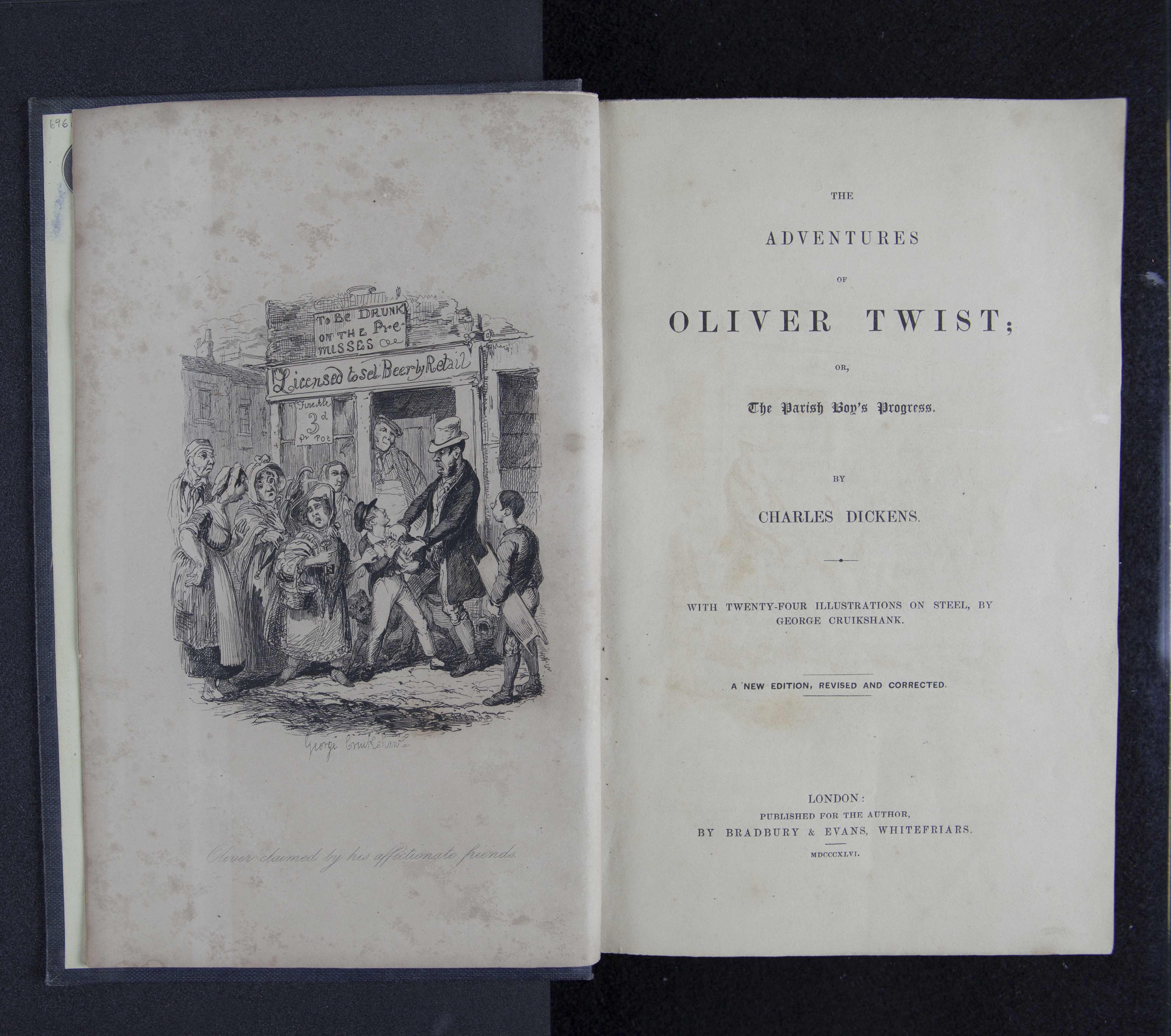
Figure 6.
Charles Dickens, Adventures of Oliver Twist, . London, Bradbury & Evans
1846.
Sadlier 696c
This edition of Oliver Twist was illustrated by the renowned artist, George Cruikshank, with twenty-four engraved plates. Cruikshank’s images helped increase the popularity of Dickens’s works, and the able caricaturist created unforgettable visuals of many of the author’s characters, including young Oliver, the fair-haired boy at the center of this frontispiece.
↩
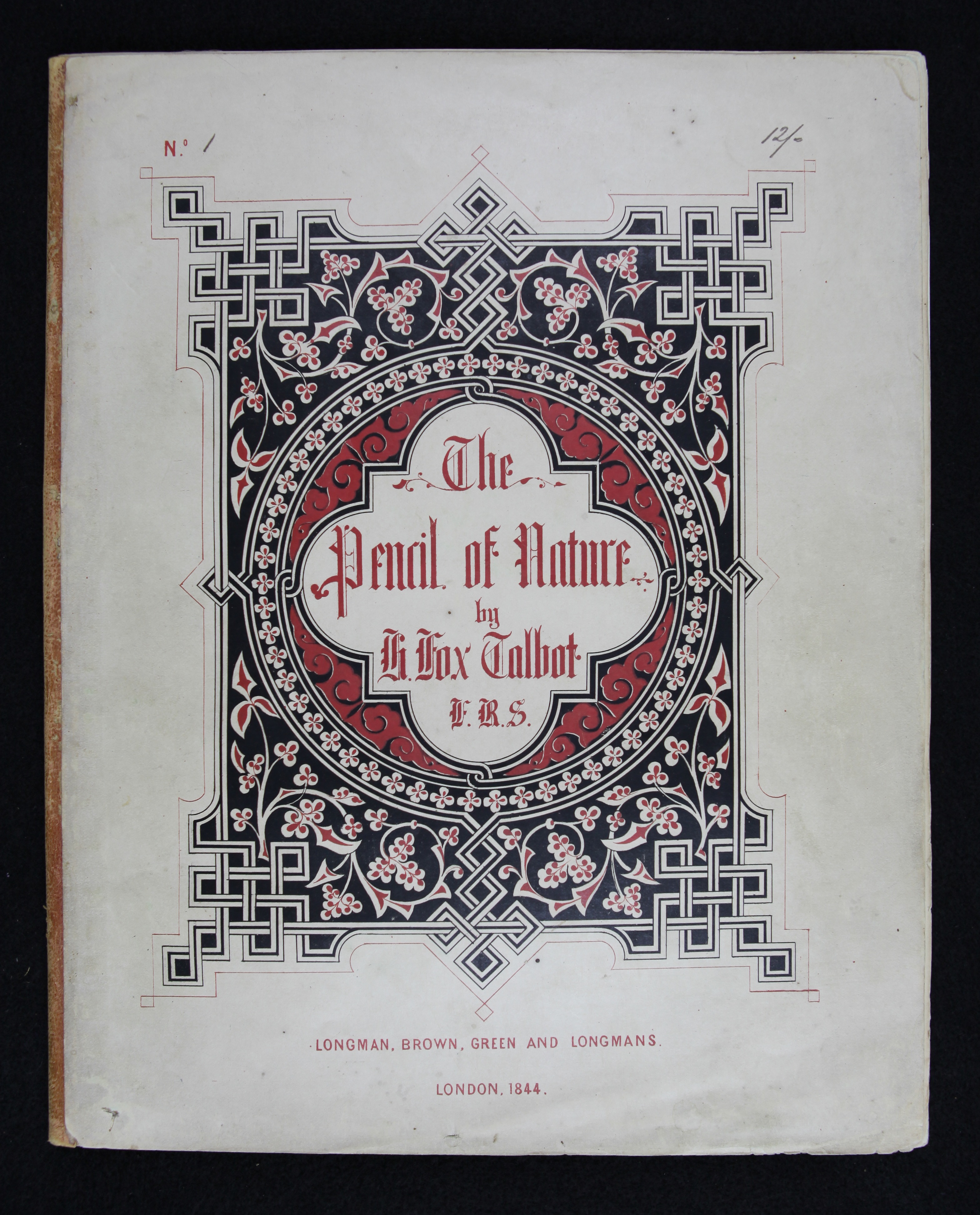
Figure 7a. William Henry Fox Talbot, The Pencil of Nature. Longman, Brown, Green, & Longmans, Pater Noster Row, London, 1844.
*TR16.3 .T142p
The title page of this book of photographs hardly suggests the presentation of a radical modern invention. Talbot’s images depict many of the same kinds of subject matter as genre scenes, still lifes, and other conventions of painting and though the art of photography would be used across a wide range of applications and themes, this initial publication shows how much Talbot’s visual sensibility was informed by the art of his age.
Figure 7b. Pencil of Nature. photographic print. ↩

Figure 8.
Aloys Senefelder, L’Art de la lithographie, . Munich, 1819.
NE2420 .S46aF
This self-published book is an introduction to the art of lithography written by its inventor, the German actor Aloys Senefelder, who invented a way of printing from the surface of a limestone block. This allowed drawings to be done directly on a stone by an artist or craftsman. In addition, the use of soft crayon and ink on the stone’s surface created rich tonal values. Within a few decades the use of color added unprecedented richness, vibrancy, and levels of realism to lithographic imagery.
↩

Figure 9.
Hannah Mary Rathbone, Lady Willoughby’s Diary, . Chiswick Press, Charles Whittingham, for the publisher Longman, Brown, Green, & Longmans, London 1844.
PR5209 .R187s
This elegantly designed and expertly printed book was credited with raising the standard of commercial printing in England. Charles Whittingham, founder of the Chiswick Press, worked with many authors including William Morris. The use of the long “s” in this text is already an anachronism in the 19th century.
↩
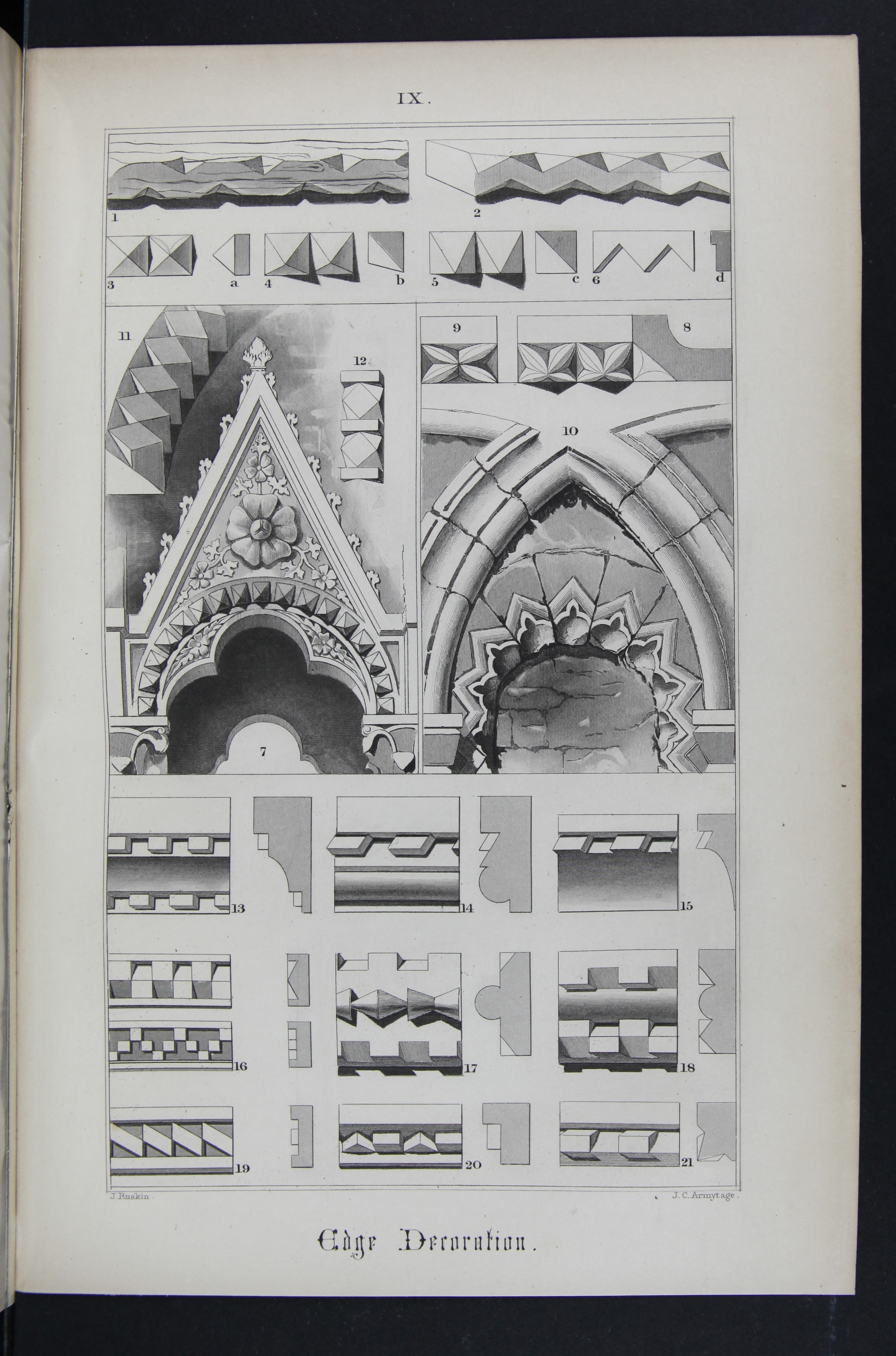
Figure 10.
John Ruskin, The Stones of Venice, . London, Smith Elder and Co, 1851.
*NA1121.V5 R8 1851
John Ruskin’s enthusiasm for the details, decorations, and architectural forms he recorded in his travels to Venice helped to fuel a revival of interest in Gothic designs.
↩

Figure 11.
William Morris design reproduced in Merganthaler’s 1915 type specimen book, New York, NY.
No call number
This note by William Morris on the founding of his Kelmscott Press was reproduced in the Merganthaler company’s type specimen book. Rather than using one of Morris’s own type designs, which he had refused to license to American foundries, they set the piece in an Old Style that was based on the letters designed by the 15th century Venetian, Nicolas Jenson. Morris had died in 1896, but his influence as a designer was long-lived.
↩
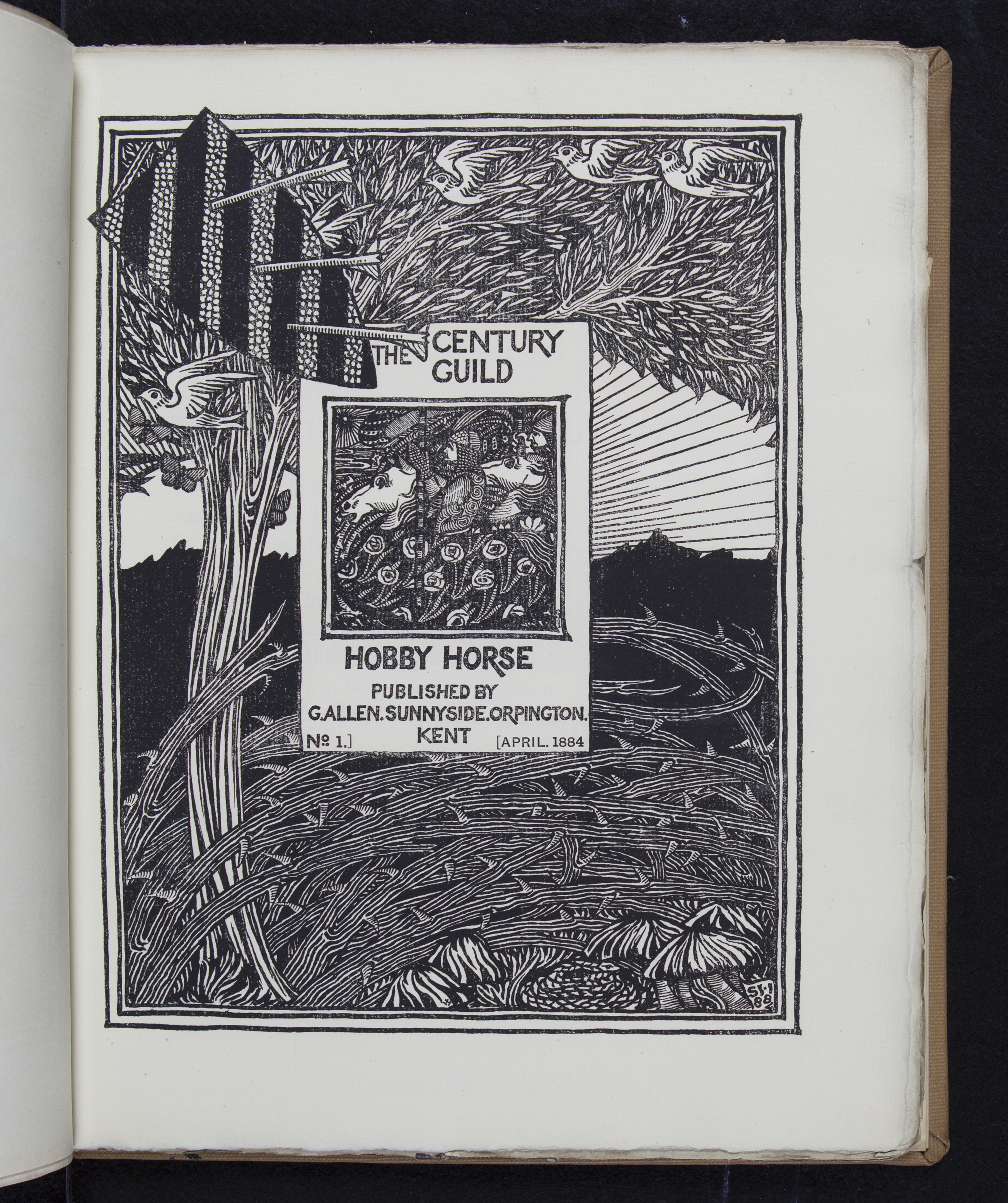
Figure 12.
The Hobby Horse, . Century Guild, London, K.Paul, Trench, and Co, 1886.
N1 .H65
Title page of the Century Guild publication, one of several societies organized by British artists and designers to combine their interests in aesthetics with their commitment to progressive social movements. The editor, Herbert Horne, worked with the famous Chiswick Press to produce the carefully crafted aesthetic periodical published quarterly for just over a decade beginning in 1884.
↩
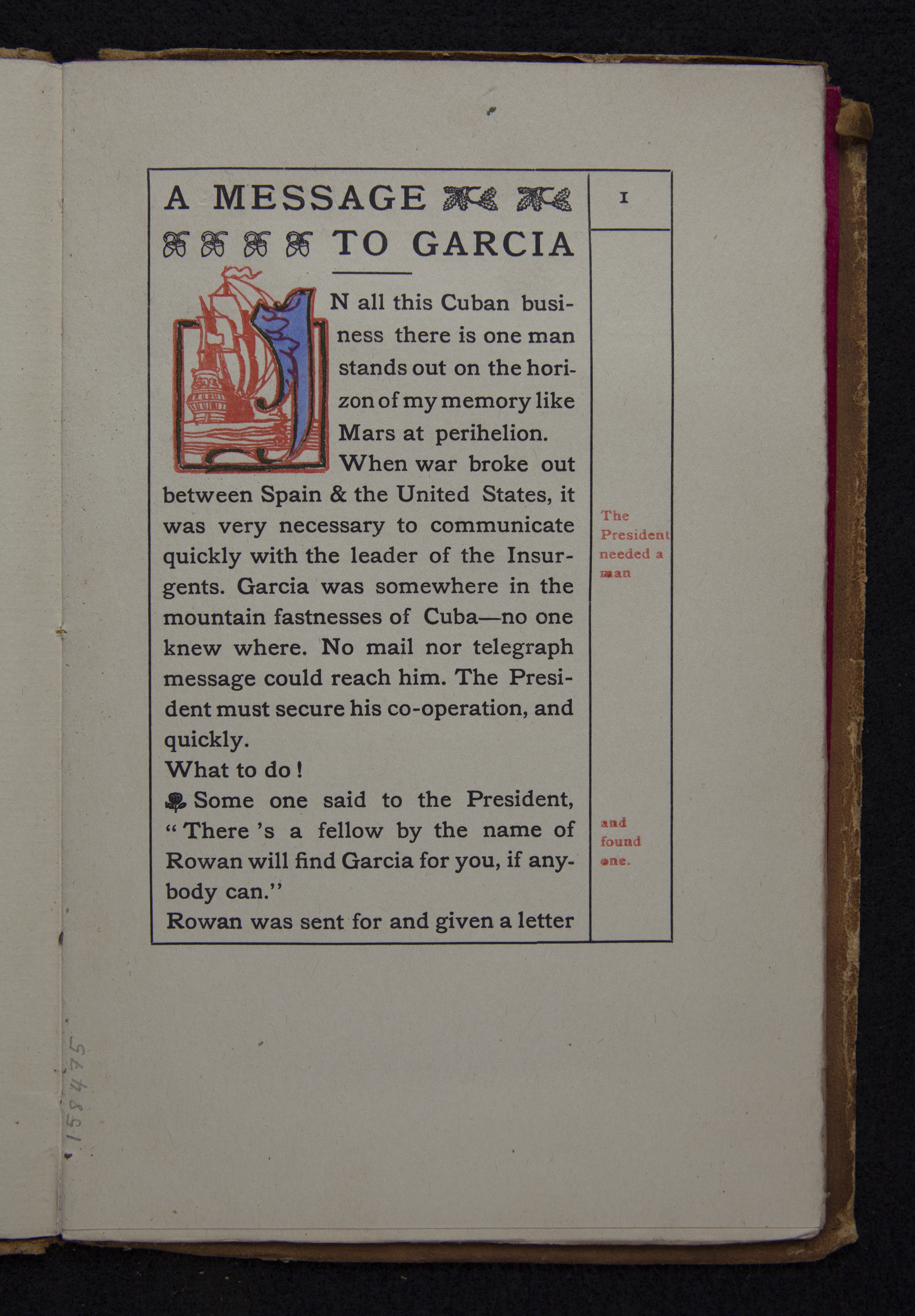
Figure 13.
Elbert Hubbard, Message to Garcia.
SCB 158475
The page designs of Elbert Hubbard’s homespun American writing in this very popular book, which celebrated the work ethic and perseverance, were clearly borrowed from William Morris, whom Hubbard had visited and admired. Hubbard’s Roycroft Press produced bibles, folksy tracts, and preachings from its site in East Aurora, New York.
↩
All images are from book in the Charles E. Young Research Library at UCLA, unless otherwise noted.